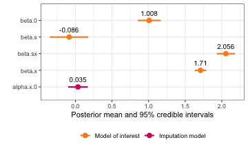
Once we have fitted an inlamemi model, we can use the
inlamemi plot method to see a visual summary of the
estimated coefficients and their 95% credible intervals.
As an example, we use a data set with missingness in one variable. For the model, we will then have three levels: the model of interest, the imputation model, and the missingness model.
mis_mod <- fit_inlamemi(formula_moi = y ~ x + z1 + z2,
                          formula_imp = x ~ z1,
                          formula_mis = m ~ z2 + x,
                          family_moi = "gaussian",
                          data = mar_data,
                          error_type = "missing",
                          prior.beta.error = c(0, 1/1000),
                          prior.gamma.error = c(0, 1/1000),
                          prior.prec.moi = c(10, 9),
                          prior.prec.imp = c(10, 9),
                          initial.prec.moi = 1,
                          initial.prec.imp = 1)
This is the default plot:
plot(mis_mod)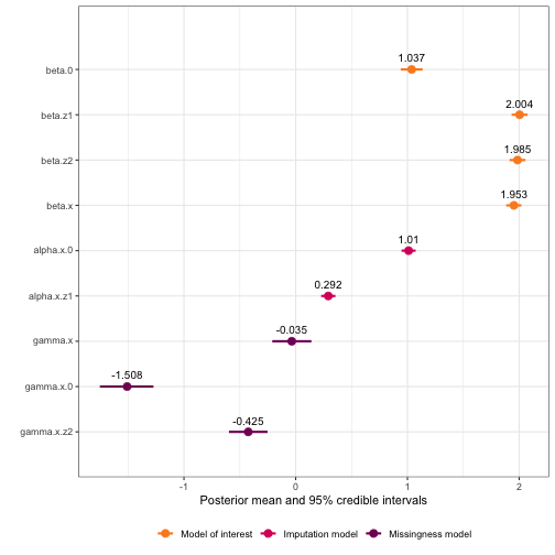 The
The plot() function
itself has some arguments that can be used to exclude sub-models, or to
create a circle highlighting the coefficients of the variable with error
or missingness. There is also an option to make the coefficient names
into greek letters:
plot(mis_mod, greek_coefficients = TRUE)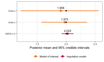
But there are also some further modifications that can be made to the
plot object, which is an object of class ggplot:
This means that we can use standard ggplot2 functions to
build on this plot.
If you are familiar with ggplot2, you know that it takes
a data frame, and then it lets us map the data in the columns very
elegantly in whichever way we specify. That means that the plot created
above has also been created based on a data frame, and in order to
modify the object further, we need to know the names of the columns, in
order to refer to them correctly. We can access the data frame like
this:
mis_plot$data
#>            coefficient_type       mean         sd quant_0.025    0.5quant quant_0.975        mode variable_raw        model_type
#> beta.0             moi_coef  1.0374729 0.04983533   0.9399896  1.03727248   1.1358512  1.03721250       beta.0 Model of interest
#> beta.z1            moi_coef  2.0037664 0.03643539   1.9323197  2.00376096   2.0752434  2.00376083      beta.z1 Model of interest
#> beta.z2            moi_coef  1.9852545 0.03636675   1.9139282  1.98525402   2.0565836  1.98525403      beta.z2 Model of interest
#> beta.x           error_coef  1.9531298 0.03471624   1.8833518  1.95361522   2.0200283  1.95569556       beta.x Model of interest
#> gamma.x          error_coef -0.0354144 0.08890319  -0.2096789 -0.03567431   0.1403648 -0.03675447      gamma.x Missingness model
#> alpha.x.0          imp_coef  1.0104936 0.03222439   0.9472832  1.01049655   1.0736872  1.01049657    alpha.x.0  Imputation model
#> alpha.x.z1         imp_coef  0.2915382 0.03253624   0.2277223  0.29153893   0.3553498  0.29153893   alpha.x.z1  Imputation model
#> gamma.x.0          mis_coef -1.5082865 0.12209425  -1.7527704 -1.50673407  -1.2731392 -1.50665424    gamma.x.0 Missingness model
#> gamma.x.z2         mis_coef -0.4246674 0.08805824  -0.5973404 -0.42466771  -0.2519926 -0.42466771   gamma.x.z2 Missingness model
#>            error_indicator  var1 var2 variable_greek   variable
#> beta.0                   0  beta    0        beta[0]     beta.0
#> beta.z1                  0  beta   z1       beta[z1]    beta.z1
#> beta.z2                  0  beta   z2       beta[z2]    beta.z2
#> beta.x                   1  beta    x        beta[x]     beta.x
#> gamma.x                  1 gamma    x       gamma[x]    gamma.x
#> alpha.x.0                0 alpha    0       alpha[0]  alpha.x.0
#> alpha.x.z1               0 alpha   z1      alpha[z1] alpha.x.z1
#> gamma.x.0                0 gamma    0       gamma[0]  gamma.x.0
#> gamma.x.z2               0 gamma   z2      gamma[z2] gamma.x.z2
Now, let’s say we would like to have three separate plots, one for
each sub-model. We could do this using facet_wrap():
mis_plot +
  facet_wrap(~model_type, scales = "free")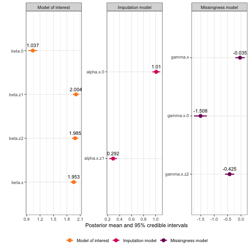
We can make the same plot with the greek names:
plot(mis_mod, greek_coefficients = TRUE) +
  facet_wrap(~model_type, scales = "free")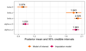
We could also add a different theme:
plot(mis_mod, greek_coefficients = TRUE) +
facet_wrap(~model_type, scales = "free") +
theme_minimal()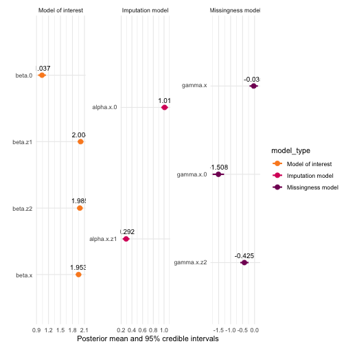 Any other changes through the
theme function could also be done, for instance we could
remove the legend since this isn’t necessary when we have a faceted
plot.
plot(mis_mod, greek_coefficients = TRUE) +
facet_wrap(~model_type, scales = "free") +
theme(legend.position = "none")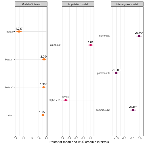 You could also change the font
and font size here, plus many other options. Here are some ways you
could modify the font in the facet header and axis title, using the
showtext package for selecting a different font from Google
fonts:
library(showtext)
showtext_auto()
js <- "Josefin Sans"
font_add_google(js)

plot(mis_mod, greek = TRUE) +
  facet_wrap(~model_type, scales = "free") +
  theme(legend.position = "none",
        strip.text = element_text(family = js, size = 13),
        axis.title = element_text(js))
The plots can also be faceted by variable instead of model level:
plot(mis_mod, greek_coefficients = TRUE) +
facet_wrap(~variable, scales = "free", labeller = label_parsed) 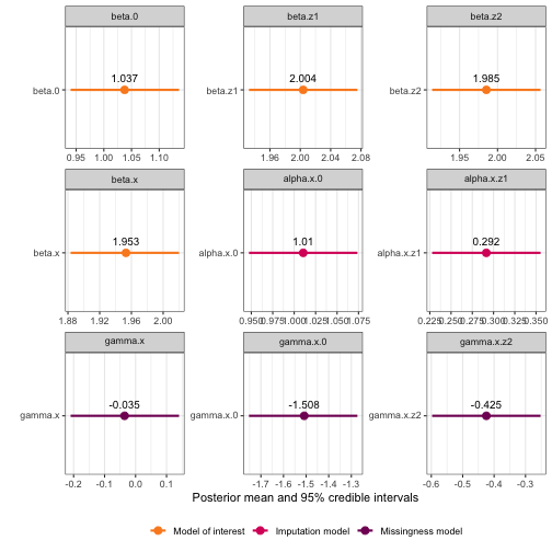 In this case, that isn’t
terribly useful, but if you for instance have estimates from another
model you would like to compare with inlamemi, you could join those
results to
 mis_plot$data and then facet by variable (with
method on the y-axis) to see the comparison clearly.
If you would like to add points or lines to the plot, this can also
be done in an additional geom layer. For instance, since
this data is simulated, I can add points at the numbers that were used
for the simulation:
mis_truth <- tibble::tribble(
~"variable", ~"value",
"beta.0", 1,
"beta.x", 2,
"beta.z1", 2,
"beta.z2", 2,
"alpha.x.0", 1,
"alpha.x.z1", 0.3,
"gamma.x.0", -1.5,
"gamma.x.z2", -0.5,
"gamma.x", 0
)
plot(mis_mod) +
geom_point(data = mis_truth, aes(x = value))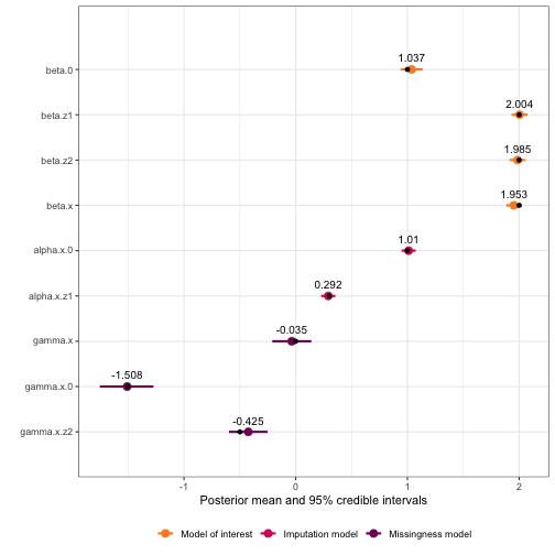 Or we could add a vertical line
at zero:
plot(mis_mod) +
    geom_vline(xintercept = 0, linetype = "dotted")